Pass or Fail? A Look at The Massachusetts Department of Elementary & Secondary Education
- Apr 21, 2025
- 4 min read
Updated: Jun 19, 2025
When I first started my recent project analyzing school performance in Massachusetts, I was intrigued by the stark differences in how schools succeed or struggle. Growing up, I always thought that a school's success boiled down to its funding or the wealth of the families it serves. But as I delved deeper, I found myself continually surprised by the complexities and nuances influencing educational outcomes.
Why This Project?
My motivation for this project came from noticing stark contrasts in school performance and wanting to understand why they exist. I’ve seen firsthand how some schools thrive while others struggle, even in similar neighborhoods. It made me question whether common assumptions about wealth and disadvantage really hold up. I set out to explore this further and uncover insights that could support educators and policymakers in building stronger learning environments. I aimed to address a significant business question:
What truly drives school performance in Massachusetts and is it more than just money and location?
What You Will Gain:
In this article, you’ll learn about the key findings from my analysis of school performance data in Massachusetts. I’ll share insights about how resource allocation and socioeconomic factors play a role in educational outcomes and highlight some surprising results that challenge typical assumptions.
Key Takeaways:
There’s a significant performance gap between top and struggling schools.
Wealth and economic disadvantage don't always predict school performance.
Adequate resource allocation is vital for school success.
Variability in support systems can lead to different outcomes, even among schools in similar areas.
Dataset Details:
I used a dataset sourced from Kaggle and the Massachusetts Department of Elementary & Secondary Education (DESE). This dataset included vital metrics like school performance, resource allocation, and socioeconomic indicators across multiple districts. It contained key performance indicators (KPIs) such as test scores, graduation rates, and demographic factors. This comprehensive data allowed me to build a well-rounded understanding of the factors at play.
Analysis Process:
To analyze the data, I went through several steps: cleaning the data to ensure accuracy, transforming it for better readability, and visualizing the findings through tools like Excel and Tableau.
Visuals and Insights:
State Overview


Massachusetts high schools show a stark contrast in performance, with multiple institutions (including charter, agricultural, and specialized schools) achieving perfect 100% graduation rates, while others, facing significant challenges, have extremely low rates, some falling below 10%, indicating a wide disparity in educational outcomes across the state.

Each point on the plot represents a specific Massachusetts high school. The X-axis indicates the school's average class size, while the Y-axis shows the percentage of its students who attend college.
The scatter plot reveals a potential positive correlation between average class size and college attendance rates in Massachusetts high schools, as indicated by the upward-sloping trend line. This suggests that, on average, schools with larger class sizes tend to have a higher percentage of students attending college. However, there is considerable dispersion around the trend line, showing many exceptions to this pattern. Schools like Boston Latin have both high college attendance and relatively large class sizes, while some schools with smaller class sizes have very low attendance rates.

The analysis of 4th-grade MCAS math performance reveals some differences across districts, though only 25% of all districts fall below the 50% threshold, leaving 25% of schools in the state in need of support and proefssional development. Further investigation into socioeconomic factors and resource availability is essential to closing these gaps.

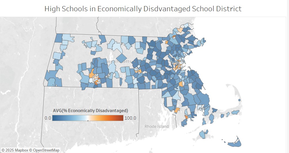


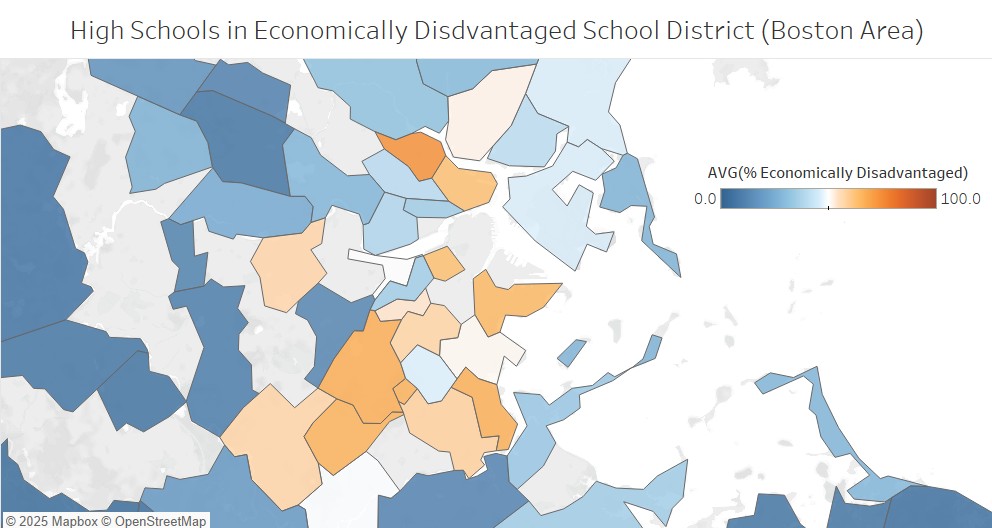
All three maps consistently reveal significant spatial disparities in the distribution of economically disadvantaged students. Some areas, particularly in the central regions of Boston and Springfield, exhibit higher concentrations of economically disadvantaged students compared to surrounding areas. The maps provide valuable information for policymakers and educators to make informed decisions about resource allocation, ensuring that resources are directed to the areas with the greatest need.
(These visualizations were created to assist the Massachusetts Department of Elementary and Secondary Education (DESE) in determining the most effective locations for pilot programs and the sharing of best practices with other districts.)
Main Takeaways:
Through this project, I learned that school performance is shaped by a multitude of factors beyond just funding and family wealth. The analysis highlighted how critical it is to consider disparities in resource allocation and support systems. Some schools manage to perform well despite financial challenges, suggesting that there are other elements at play worth investigating further.
Conclusion and Personal Reflections:
This journey taught me a lot about the complexities of education. One of the biggest challenges I faced was reconciling the data with real-life stories from the schools. I was often caught off guard by the disparities, and it motivated me to delve deeper...learning new skills in visualization (maps!) Understanding these patterns has reinforced my belief that informed decision-making can lead to better outcomes for all students.
If you found this exploration insightful, I encourage you to connect with me on LinkedIn. I would love to discuss your thoughts or answer any questions you might have. And if you or someone you know is looking to hire a data analyst, let’s chat!
